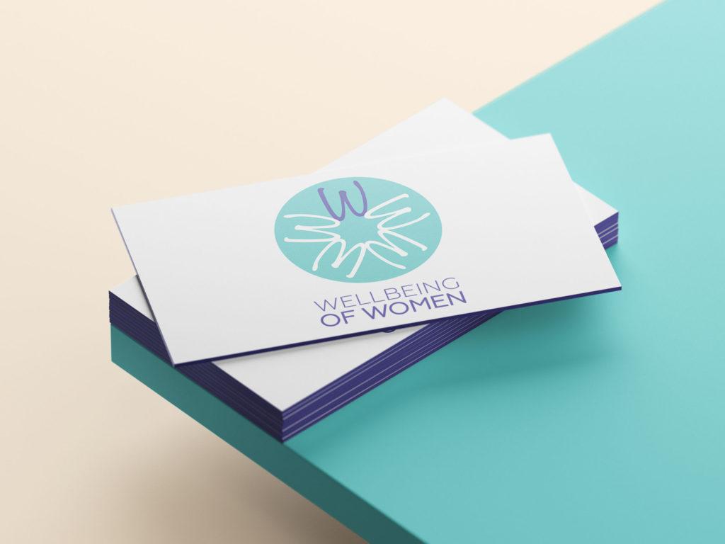
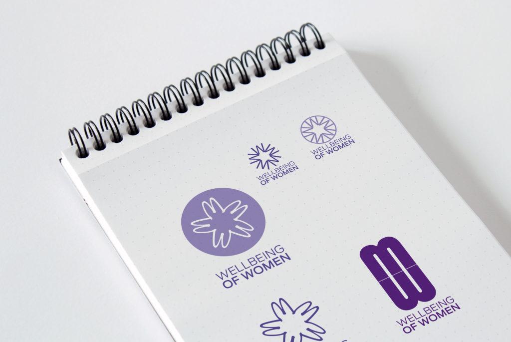
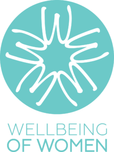
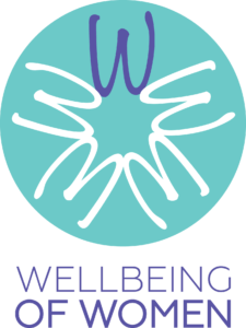
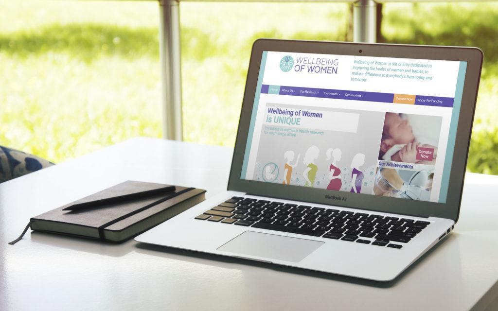
Whilst working with boutique London agency NU Creative, I worked on this logo and colour refresh for 'Well Being of Women', a women's health charity.
They were looking for a refresh from their previous brand, which consisted of a dark purple and sharp edges in their logo to something softer and more feminine.
I helped to create a new colour palette, with softer pastels and an adjustment to softer curved lines on their logo. The idea behind the logo is that the negative space in the centre of the W's creates a star.